Task: Redesign of the existing and design of the new sections of an IT management system.
My areas of responsibility: Wireframing/Prototyping, UI/UX Design.
Tools: Whiteboard, Paper, Axure RP, Adobe Illustrator/Photoshop.
HP Managed Services is a cloud-based IT management system for configuration, installation and management of different kinds of devices. It is based on the HP Touchpoint Manager product but has more services and features, as well as more complex structure and different set of user roles. The task of my team was to design these new features and services, and to adjust the existing design for new user roles.
1. Ideation
Every big part of the project started from the whiteboarding sessions in our UX lab. Designers, developers and project managers got together to discuss user profiles, features, goals, and the way to solve the design problems.
The agile development process required working on separate features and providing the final result every two weeks (each sprint). We needed to incorporate the new design patterns into the old product, keeping it consistent and easy to use. On this stage, the constant collaboration with product managers and developers was important to make sure we were always aligned with the business and technical requirements.
Also, our design team decided to work on every task in small groups (‘squads’), so that every design decision would not depend on only one person. Every ‘squad’ included one or two interaction designers, who were in charge of the interactions, and one visual designer, who was responsible for the interactive prototypes and design mockups.
2. Defining user flows
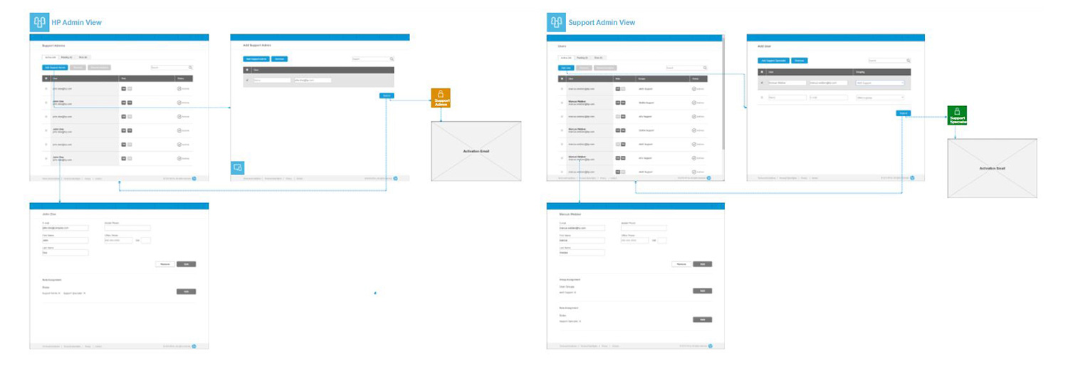
Defining the right user flows was one of the most important parts of the design process. The complexity of the product required creating user flows for every major feature. Some processes required sending email notifications or signing in to services like Apple DEP and Windows Information Protection. The most effective way to define and show the flows was to use low-fidelity wireframes with connections not only between pages but also between the particular elements of the interface.

3. Sketching and prototyping
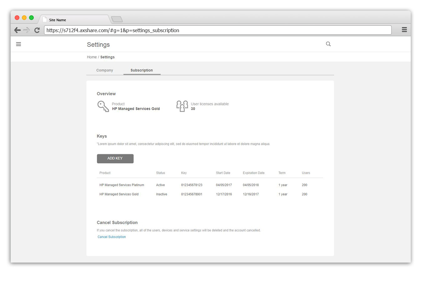
While working on the prototypes, my team needed to finalize all the UI interactions and texts, so that we could save time on updating the design mockups in future. One of the challenges at this stage was to provide the best possible designs using a limited number of available UI elements from HP’s frontend framework.
To speed up the prototyping process, I created an Axure library with all UI components that were used in the design mockups. The final library included not only static UI elements but also interactive widgets like tables with filtering options, search fields, expandable and collapsable panels, etc. It helped me and the whole design team to create the prototypes much faster.

4. Visual design
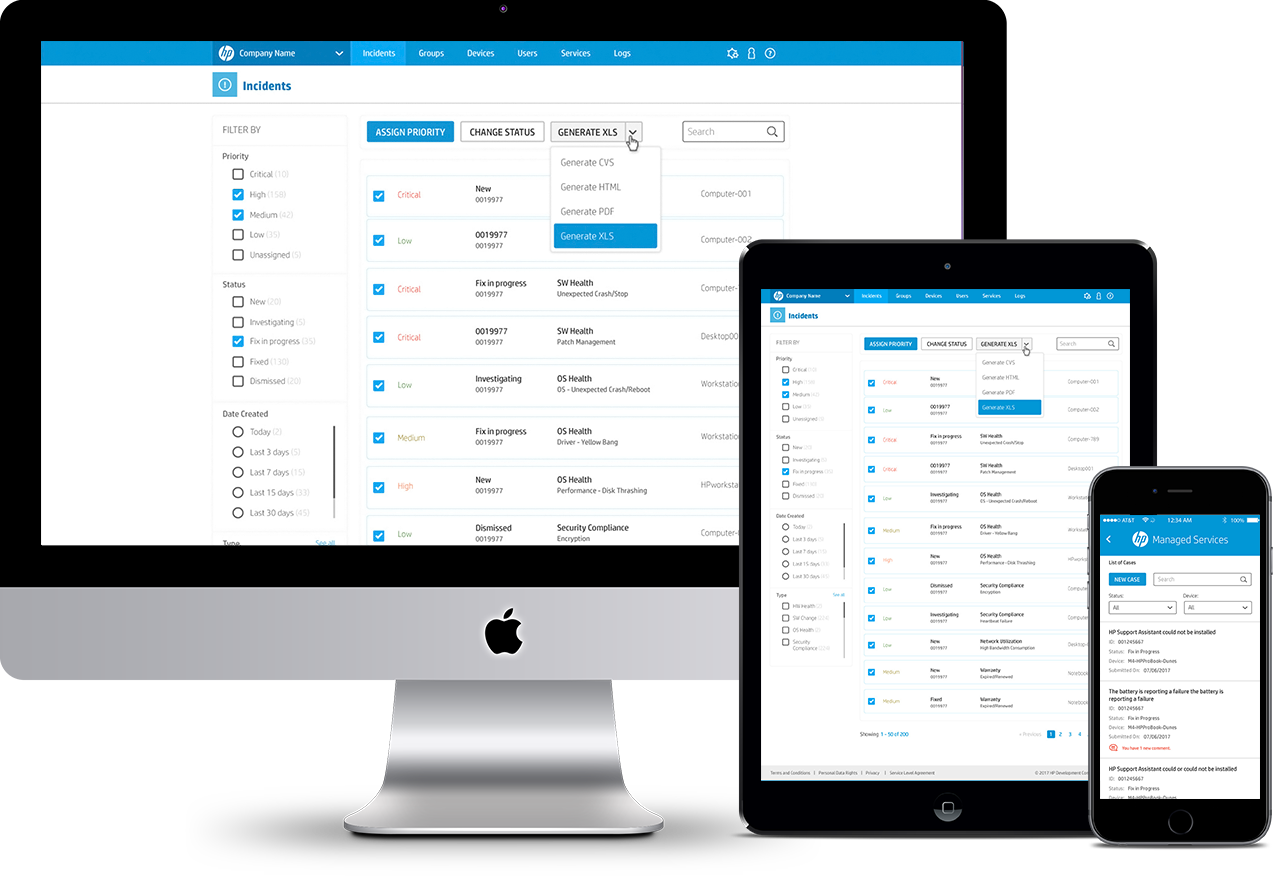
During the redesign process some pages were kept in the old design style and interaction patterns and were gradually replaced with the new ones. The long-term nature of the project required special attention to the consistency of the resulting UI. To maintain the consistency, my team leveraged the UI kit, adding the new elements to it from time to time. For one of the most used patterns, I created a reusable design template, which helped to create new pages very quickly.

5. UI reviews
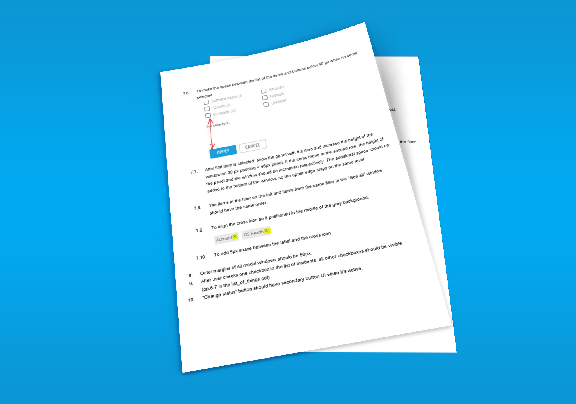
UI reviews were one of the most important parts of the visual design process. After the implementation, the mockups always undergone a very detailed UI reviews because the first versions always had some deviations from the originals. Every little detail, from tints of the colors to sizes of the fonts, needed to be checked in order to capture all deviations in a summary document. This work required significant attention to details and played a major role in ensuring the high quality of the final product. I was the key person of the team, driving these reviews.

