Task: Redesign of a hardware vendor’s corporate website.
My areas of responsibility: Interviews with stakeholders, Information Architecture, Wireframing/Prototyping, UI/UX Design, Specification, and Project Management.
Tools: Axure RP, MindMeister, Adobe Photoshop CC, Worksection, Asana.
Result: aq.ru
Aquarius is the largest IT vendor in Russia. Nonetheless, its website didn’t really reflect that – it could have been mistaken for a website of a small insurance or financial company. The company’s mission was hard to identify and could only be understood by reading the description in the “About” section of the website. That is why the first problem to solve was to make the website explain what the company was offering to its customers. Another problem was that the website had inconsistent navigation and its content wasn’t logical and well-structured. Additionally, the website’s look and feel was very outdated, especially in comparison to the local and foreign competitors.
Finally, product managers couldn’t edit product pages in a convenient way and rapidly produce and update product brochures. They had to spend a lot of time to maintain actual information about products and services.
1. Interviews with key stakeholders
I began the project by interviewing key stakeholders – product, marketing and support managers – to define requirements and expectations. The basic requirement was to get a solid-looking website with clean minimalistic design and well-structured product catalogue.
Without the time or budget needed to interview real users, I gathered information about website audience and user needs from marketing and support managers.
Interviews with product managers also showed that they had usability problems with editing product pages and creating product brochures. One of the main problems was that the managers couldn’t use CRM to edit content. I proposed to design an interface with a simple WYSIWYG editor that allowed them to create and edit product pages very easily and automatically generate product brochures. This solution was easy to use for all managers regardless of their level of knowledge of the CRM system.
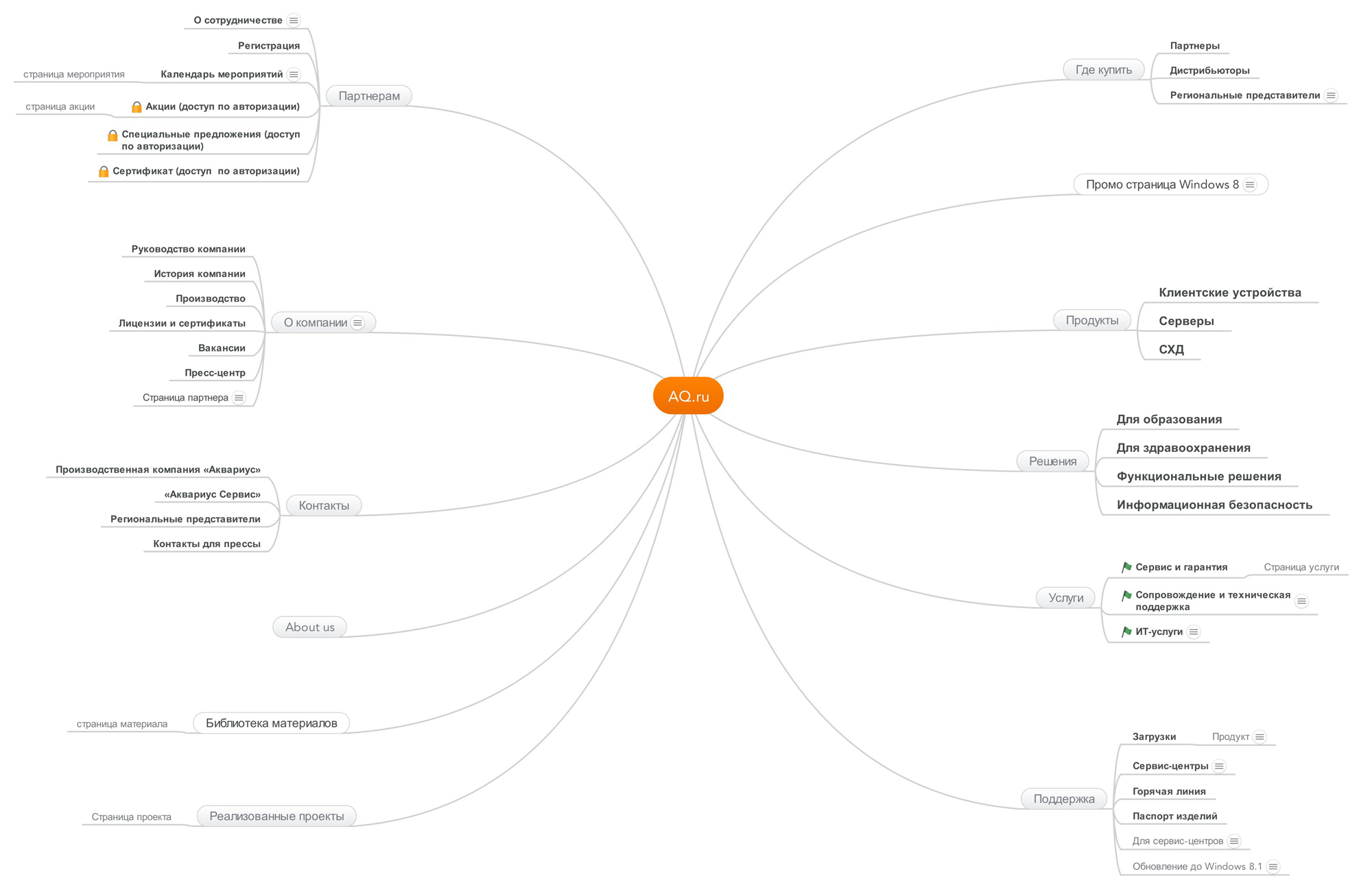
2. Website structure and navigation
The website contained an enormous amount of diverse information that called for very clear structure and navigation. Moreover, the website audience was very segmented and each segment needed quick access to the relevant information. I analyzed the information from the interviews with the product and marketing managers and created a website structure that addressed the needs of users.

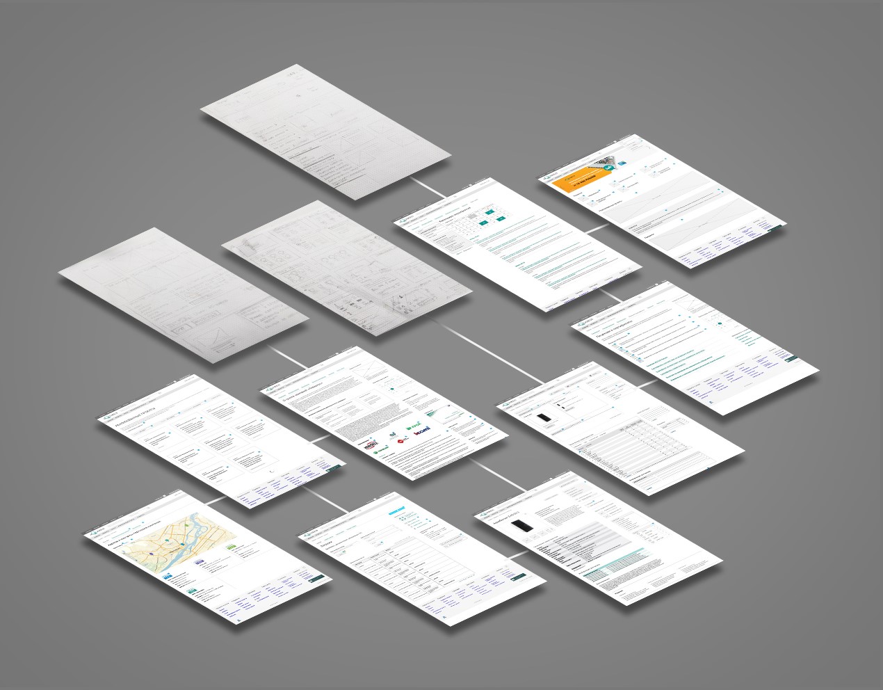
3. Wireframing and prototyping
During this process I started from the low-fidelity paper wireframes and worked toward the medium-fidelity HTML prototypes. A well-planned hierarchy of content was essential for maintaining good readability. To help users navigate easily throughout the website I created clean, structured layouts for each page and added related content sections.
A standalone task was to develop the WYSIWYG editor for product pages. I designed an intuitive interface that didn’t require special training or a complicated user manual.

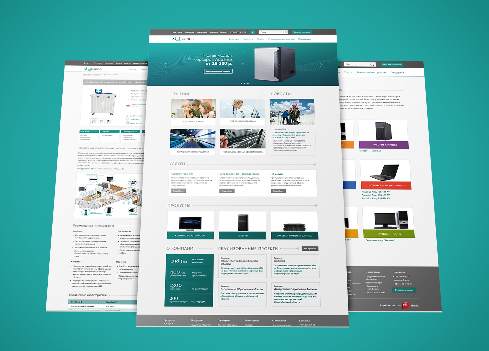
4. Refining design
The work on mockups was the most challenging part of the project because of internal resistance to substantial changes in the design. Several iterations of mockup design had to be done in order to reach a compromise. Finally, working closely with management, I developed a well-received concept, which was modern, minimalistic, and matched the corporate branding guide.

5. Managing the development process
My role in this project was not only designing the interface but also managing the design, building, testing, and implementation phases of the development process using the sequential waterfall model. The most challenging and, at the same time, interesting part for me was to address the compromises: as a UX designer, I wanted to implement the best solutions for the users, and as a project manager, I had to stay within the limits of budget and time. Ultimately, I found the right balance and delivered the project on time.
It was my first experience managing a large web project. I learned a great deal about communicating with clients and problem solving in the IT industry.
